Planning Policy Bias for Materiality Over Form
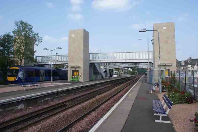
In the Scottish burgh town of Dunblane, known for its medieval cathedral and victorian spa; the railway station (circa. 1848) has just received a new footbridge (pictured).
The prominent lift towers of the new bridge are designed as plain volumes in stone. Great effort has been put in by the designer to make them read as ‘perfect’ cuboids, with no detail or coping to interrupt their minimal singularity. Given that they are built in a Conservation Area of an historic town, how is this approach remotely appropriate for its context? Everything around the locality is fractal in layered detail: from the butressed Victoria Hall, to the vernacular cottages, to the contemporary church across the road, every other building in the street displays many levels of detail on traditional form pitched-roof blocks.
As the location is a Conservation Area it’s clear that the Planning Department would place on any design a requirement to fit the context. Station owners Network Rail described: “In keeping with the wider conservation area, a sympathetic design was approved by the council which includes finishes in keeping with the surrounding buildings… The bridge will also be constructed with materials sympathetic to the existing station structure.” “These enhancements will protect the historic appearance of the station”
The designer, presumably at the behest of Planners, has used ashlar blonde sandstone at some expense to match the surroundings, but no attempt has been made to match in language or grammar or form. This is strange since the surrounding buildings show a range of materials including brick, render, rubble stonework, dressed red sandstone and timber. Several buildings are notable for using two or more contrasting materials for visual liveliness.
This approach of matching local materials but ignoring local form is symptomatic of Planning Policy’s bias in handling of context. The design in its materiality conforms to a status quo that doesn’t even exist, but in its language and detail ignores a consistent contextual precedent. Why? Because Planning Policy does not permit officers to prescribe a style for new development (and hence also language and detail). So in cases where conservation of local character is desired the principal tool to be used becomes prescribing or limiting materials.
In addition to this, prevailing conservation policy often requires that when an historic building is altered or extended the new construction must be expressed as distinct so that new and old cannot be confused. A classic case of this can be seen below: Old house. Modern box. Clear distinction.
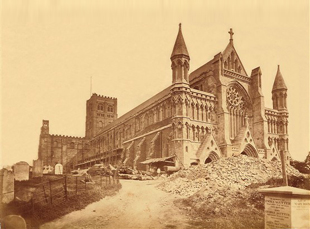
Whilst the aim of this policy is to ensure that our historic record does not get muddied by later modifications, as per St Albans Abbey, which had a Victorian makeover so comprehensive that it is now virtually impossible to see what’s medieval and what’s not (below before and after).
The unfortunate by-product of these two policies: distinction of periods and prescription of materials for the purpose of congruence, is that Planning policy instead of being style-neutral actually has an intrinsic bias towards the kind of Modernist and reductionist design that we see in Dunblane’s footbridge.
These restrictions result is a token tick-box response to conserving local character rather than a nuanced approach of true understanding of context and creative response. Whilst I’m not advocating the pastiche replication of style or form, I believe that in order to create good quality design that preserves and enhances our historic places there needs to be a conscious and intelligent handling of language and aesthetic detail; as those things often mean as much to local character and identity (and arguably to beauty) as do materials.


